You are viewing a single comment's thread. View all
2
HerrBBQ on scored.co
1 year ago2 points(+0/-0/+2Score on mirror)2 children
I appreciate the point of this post, but I think it's worth noting that you (or some other autist) made this graph yourself and the data points are completely made up.
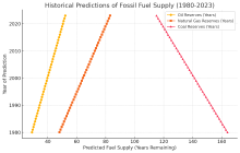
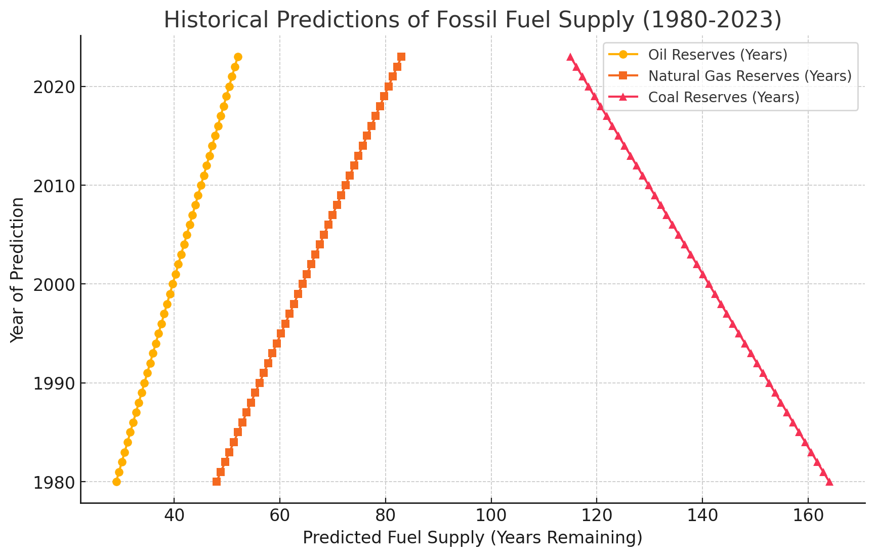
And for anyone who thinks I'm talking out of my ass, there's zero matches on reverse image search, meaning this graph was never published in any journal or news site. The design is too mediocre to be professionally made: It's highly unconventional to put the year on the Y axis, the data lines don't have contrasting colors, and it's unnecessary to have "years" or "years remaining" in BOTH the label of the X axis AND the key. This looks like something Excel would spit out on the first try before you went back into the data and settings to make it look nicer. Finally, let's be real, does anyone believe that there was exactly one "prediction" (from who?) for all three resources exactly every year for the entire timespan of this graph, and all of those predictions are perfectly linear when plotted? I'm not that gullible.
1 year ago4 points(+0/-0/+4Score on mirror)1 child
Wow you're pretty fucking dumb if you think that makes your graph a good dataset. ChatGPT gave you the best data it could scrap together and you basically forced it to mangle it up into an inaccurate and useless mess. Great job. "Take these data points from every decade and make them annual" Big fucking surprise it just smoothed the data out into a line, which makes it useless.
Do you not know what interpolation is? Not that that's what I even asked it to do, but that is what it did. Doesn't make the data any less useful. There's a trend and you can see it. You're a fucking retard
And for anyone who thinks I'm talking out of my ass, there's zero matches on reverse image search, meaning this graph was never published in any journal or news site. The design is too mediocre to be professionally made: It's highly unconventional to put the year on the Y axis, the data lines don't have contrasting colors, and it's unnecessary to have "years" or "years remaining" in BOTH the label of the X axis AND the key. This looks like something Excel would spit out on the first try before you went back into the data and settings to make it look nicer. Finally, let's be real, does anyone believe that there was exactly one "prediction" (from who?) for all three resources exactly every year for the entire timespan of this graph, and all of those predictions are perfectly linear when plotted? I'm not that gullible.